Recent research reveals that people make a subconscious judgment about a person, environment or product within 90 seconds of initial viewing and that between 62% and 90% of that assessment is based on color alone. The right brand colors can help you connect with your customers and draw their attention more effectively to your goods and services.
Before you select your brand colors, ask yourself what you want your visitors to feel when they see your website. For instance, do you want your website to convey warmth and nurture or energy and excitement?
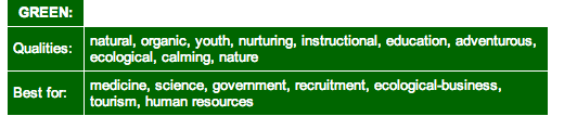
Different colors can represent different messages. For instance, green conveys nature, adventure and youth while black conveys credibility, strength and power.

Once you have agreed on your brand’s personality, you can then select the right colors that would accurately represent it. Colors can represent warmth, confidence, prestige and a host of adjectives that can trigger various emotions from your visitors.
Below is an infographic that shows how colors affect emotions and how your customers perceive various global brands. Think about what would you like your brand colors to tell your website visitors.

Next, pick what combination of colors you want to represent your brand. For instance, do you want complementary colors or contrasting colors? Complementary colors bring out the attributes of each other and connote harmony while contrasting colors adds an element of surprise to your brand. Multi-colors help to add a fun and playful vibe to your brand and also connotes variety. Here is a color guide that can help you decide on what combination of colors to select for your brand.

Next, you should think of what hues you want to use for the colors you have selected. Hues help to tone down or give more prominence to colors. For instance: How much white or black do you want your selected colors to have?
Choose your hues carefully to make sure you accurately trigger the right emotions. The image below shows the transition in hues as various colors are made lighter or darker.

When you pick your brand colors, think through how these colors can increase the conversion rates of the products on your site if you intend to sell online. For instance, take a look at the following call-to-action buttons and how they affect how online buyers think about the product.
The yellow “buy” button is used to grab the attention of window shoppers while the red “buy” button is used to create a sense of urgency about the sale.

Smart website owners use call-to-action buttons to effectively get website visitors to complete actions that are beneficial for their business. For example, the buttons can be used to persuade customers to call your business, sign up for your newsletter, download an ebook, schedule an appointment or buy your product.
To match the call to action buttons with your brand colors, you can use complementary or contrasting colors depending on if you want to call attention to the message on the button or have it blended into the site as a more passive message. You can also play around with how the buttons blend into your color scheme by having it match your site’s background color, if you have one. This is a great way to get the button to stand out. Here is an example of how complementary colors can help your call to action stand out:

The right brand colors and call-to-action buttons can help you achieve your goals with your website and speak to your customers effectively. Try some of our tips out and watch your business grow online!
For those of you using Yola, you can check out our Style Designer feature that can help you choose the right styles and colors for your website.
Pingback: How to Create Effective CTAs | Yola
Pingback: Why Brand Identity and Logos Help Your Business | Yola
Pingback: What to Use for Your Website and Blog: Headlines, Sub Headlines, Paragraph Text and Lists | Yola